Global Design System & Component Library
Role:
Deliverables:
Senior Product Designer
Comprehensive Web Style Guide, Authoring Component Guide, Responsive UI Kit
01. The Objective
To move away from ad-hoc page creation and establish a "Single Source of Truth" for the engineering and content teams. The goal was to create a modular design language that ensures visual consistency across thousands of pages while strictly adhering to a vertical rhythm and grid system.
02. Foundations: Typography & Rhythm
We established a strict hierarchy using Founders Grotesk to distinguish clearly between immersive reading and utility data.
• Body Copy: Designed for long-form reading contexts.
• Small Copy: Reserved exclusively for sidebars, rails, and UI elements where space is at a premium.
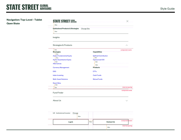
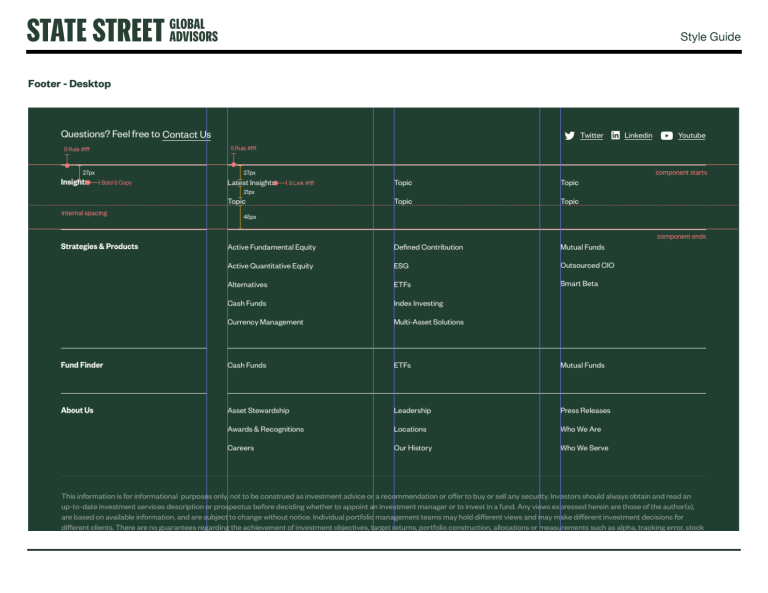
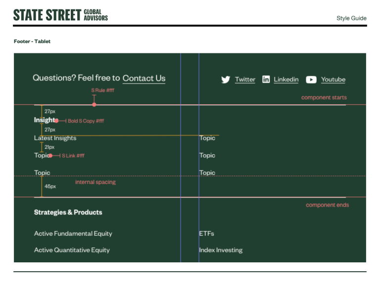
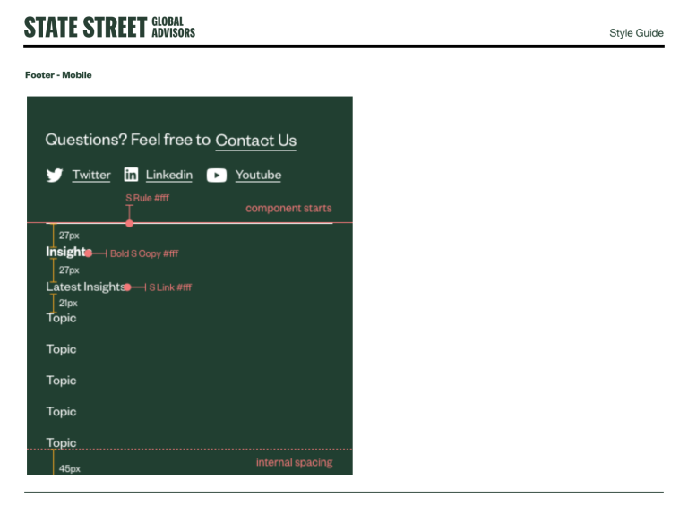
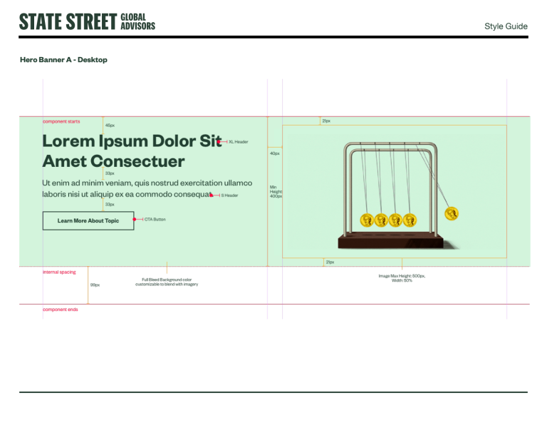
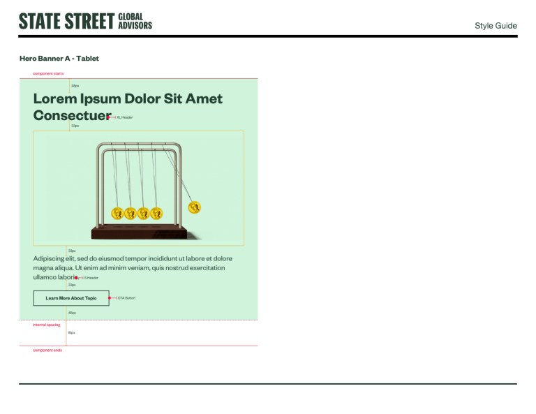
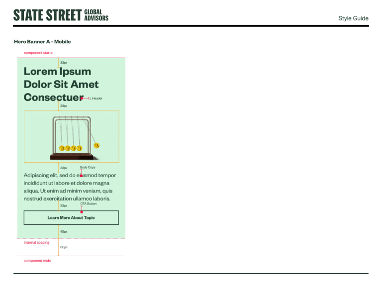
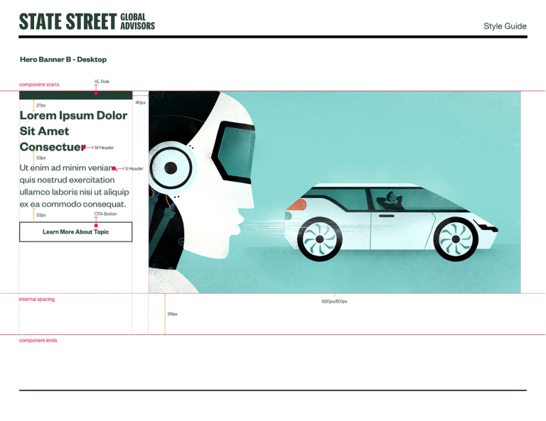
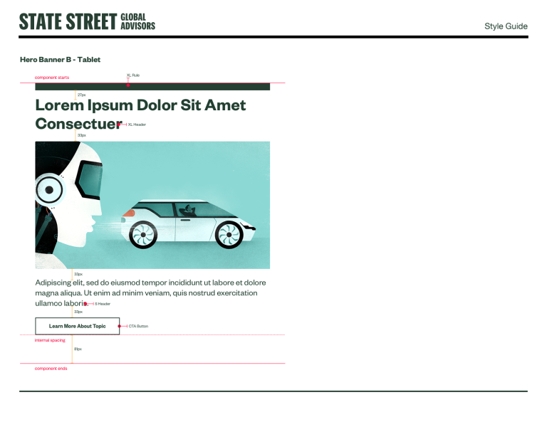
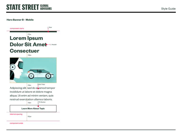
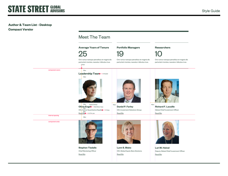
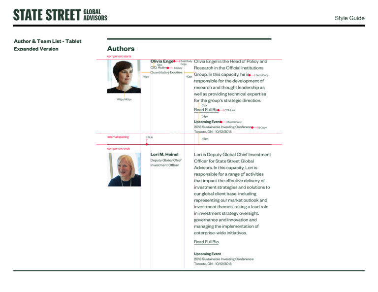
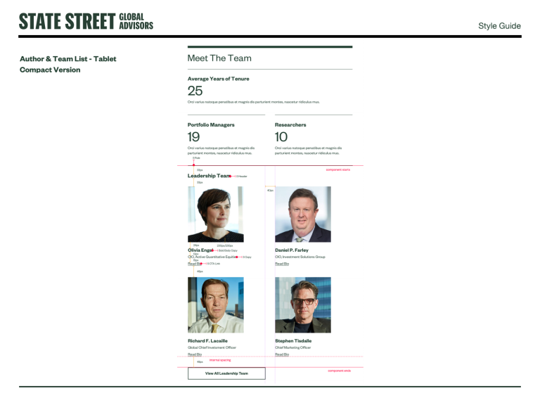
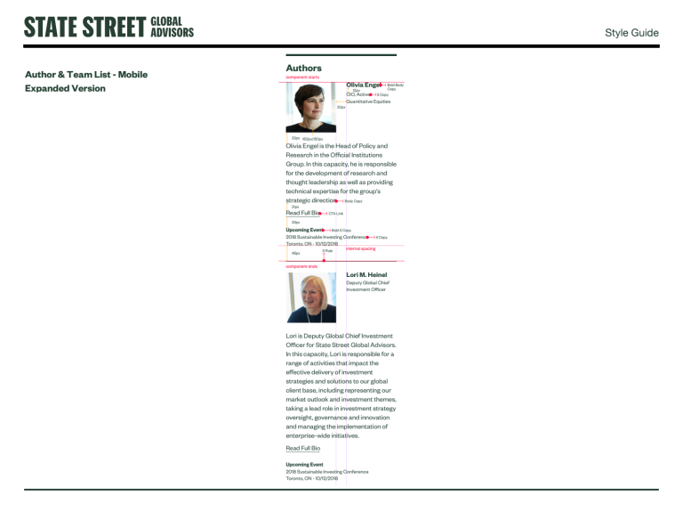
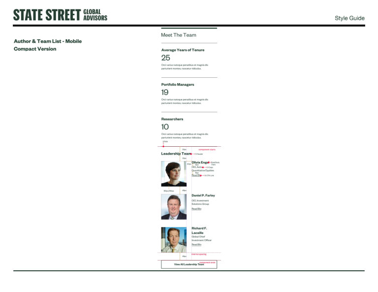
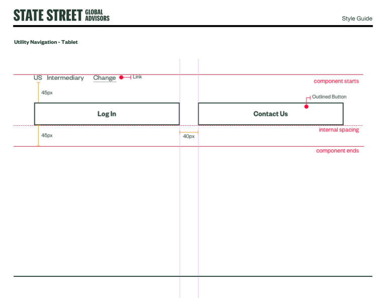
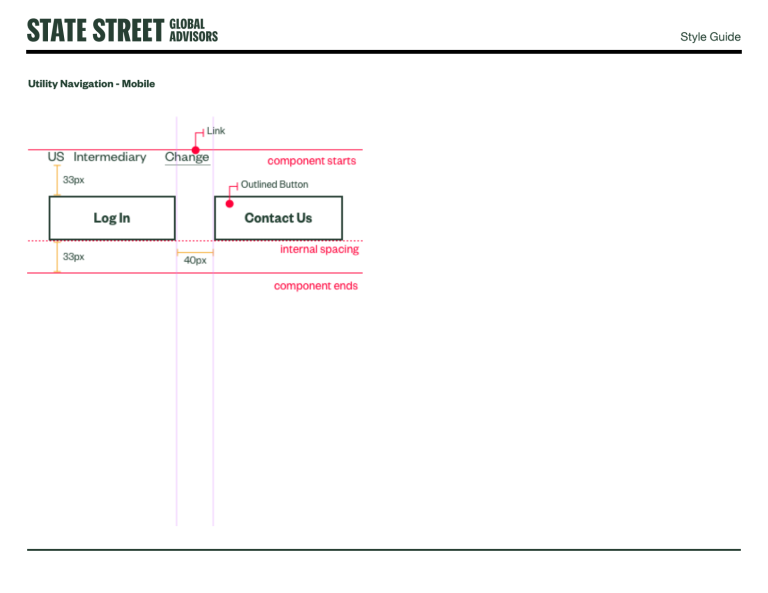
• The "Rule of Three" Grid: A rigid vertical spacing protocol was implemented where all spacing is divisible by three (e.g., 33px, 45px, 60px) to maintain a consistent harmonic rhythm across all device viewports
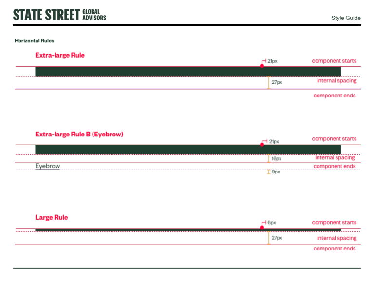
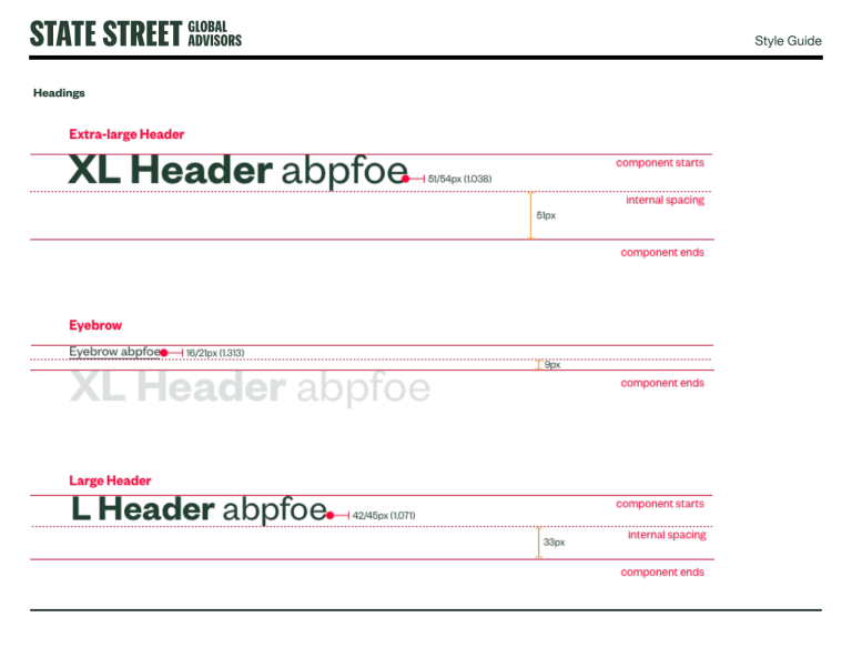
03. Structural Elements: Headers & Rules
To manage high-density information, we developed a system of Horizontal Rules paired with Typography. These aren't just decorative; they are structural elements used to define content hierarchy
• XL to Small Headers: A scalable type scale ranging from XL Headers (paired with XL Rules) down to Small Headers
• Eyebrow Text: Integrated above headers to allow for categorization without disrupting the page flow
• Logic: Rules are suppressed when redundant (e.g., next to image fields) to reduce visual noise
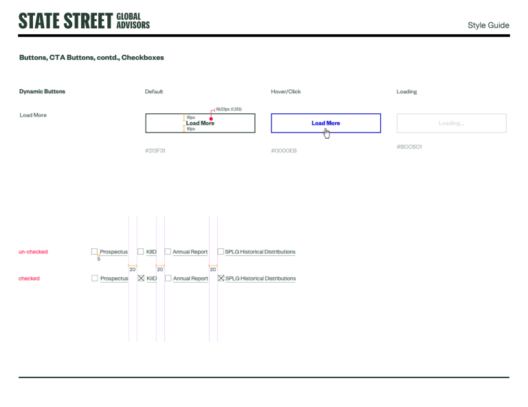
04. The Component Library
We moved from "Page Templates" to an "Atomic" Component Architecture. This allows authors to construct pages using pre-validated blocks.
Navigation Ecosystem
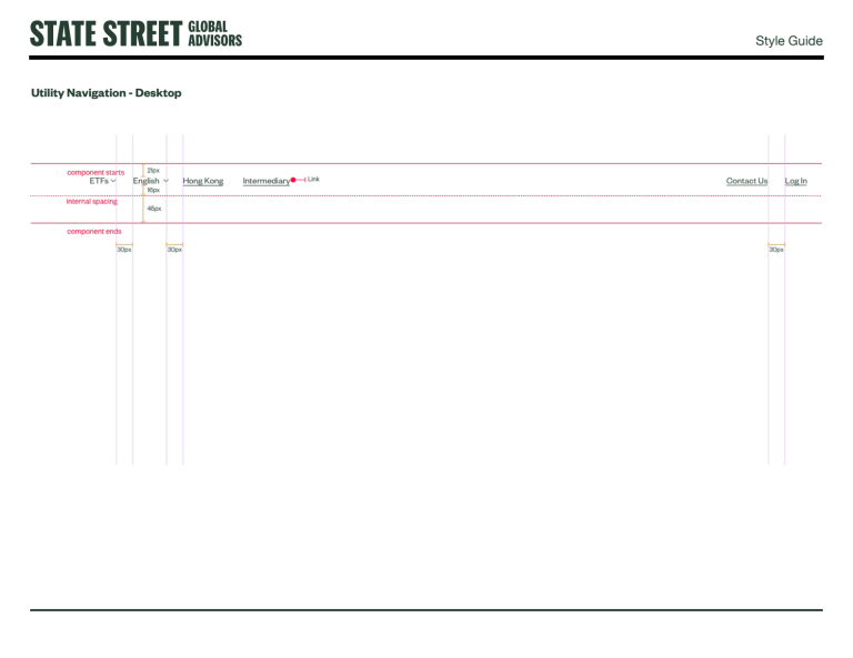
• Utility Navigation: A streamlined top bar for high-frequency tasks (Login, Contact, Language Selection).
• Mega Menu: A scalable Top-Level navigation capable of housing complex hierarchies like "Strategies & Products" and "Insights.
• Footer: A modular four-column layout that adapts fluidly from Desktop to Mobile, prioritizing social links and legal disclosures.
Interactive Data & Media
• Financial Tables: Designed with "off-grid" column logic to maintain readability for complex ticker/performance data while fitting within the main container.
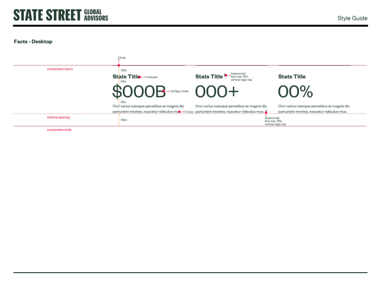
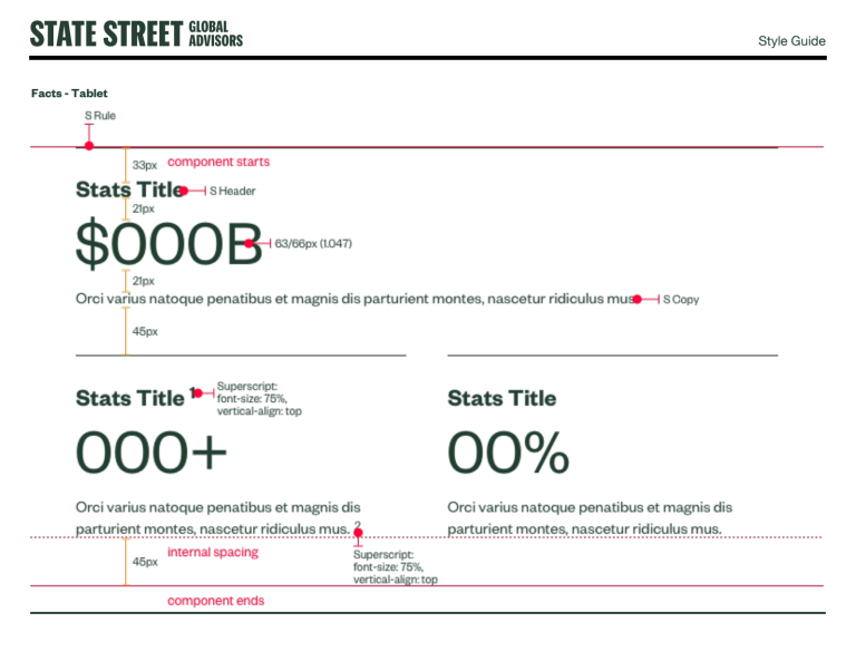
• Fact Cards: High-impact "Stats Titles" using superscripts for currency and percentages (e.g., $000B AUM) to highlight key performance indicators.
• Rich Media: Standardized Brightcove integration for both Video and Audio/Podcast players, ensuring consistent playback controls and captioning
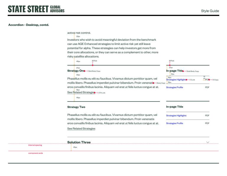
Engagement Modules
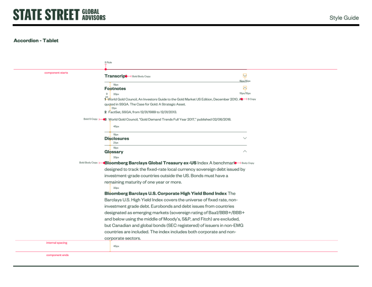
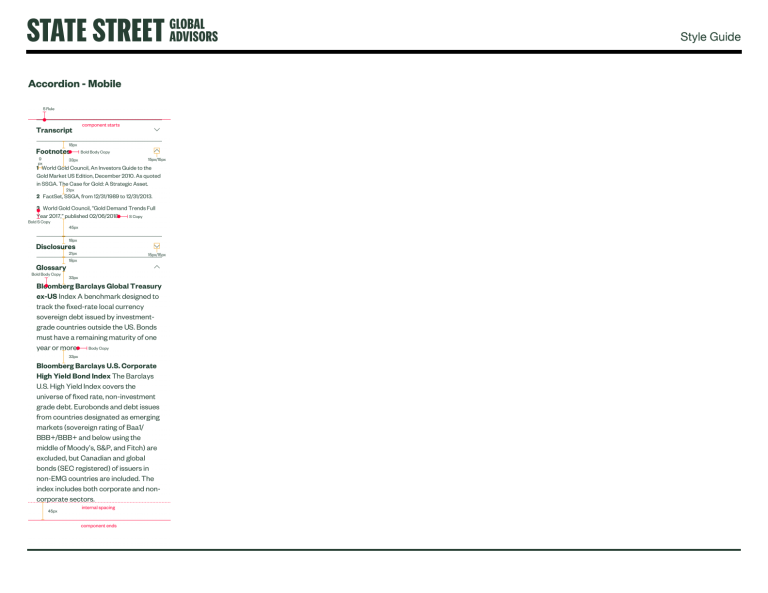
• Accordion Systems: Developed for dense content like "Footnotes," "Disclosures," and "Glossaries," allowing users to expand legal text only when necessary.
• Filtering: A robust sidebar filtering system (CheckBox logic) designed for high-volume content pages like "Insights" and "Fund Finders".
05. Documentation for Scale
A design system is only as good as its documentation. I created specific guides for different stakeholders:
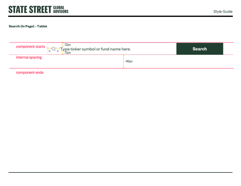
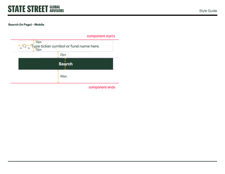
1. Web Style Guide: For designers and developers, focusing on hex codes, padding pixels (e.g., 40px internal spacing), and hover states
2. Author Component Guide: For CMS content creators, explaining when to use a component (e.g., "Use the 'Feature Funds List' to link to fund detail pages")
Senior Reflection
By defining clear rules—such as buttons never exceeding four grid columns on desktop and enforcing a strict vertical rhythm—we reduced QA cycles and empowered the development team to build faster. This system transformed the website from a collection of static pages into a living, scalable product.