Institutional Digital Brand Framework (DeAWM)
Role:
Deliverables:
Design Lead / Brand Guardian
Online Design Principles, Digital Identity Guidelines, Advertising Standards
01. The Objective: The "Platinum" Standard
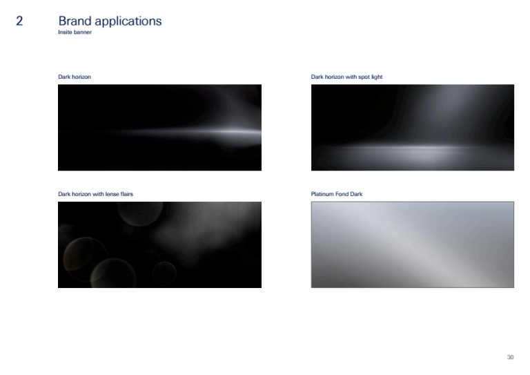
In the high-net-worth sector, trust is visual. The objective was to unify Deutsche Asset & Wealth Management’s digital presence under a single, premium aesthetic known as the "Platinum Light Style." This framework was engineered to ensure that every digital touchpoint—from intranet banners to external advertising—conveyed a "chrome-like," self-confident, and modern appearance
02. Visual Foundations: Contrast & Restraint
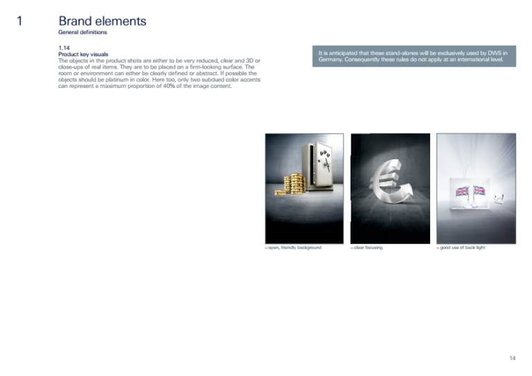
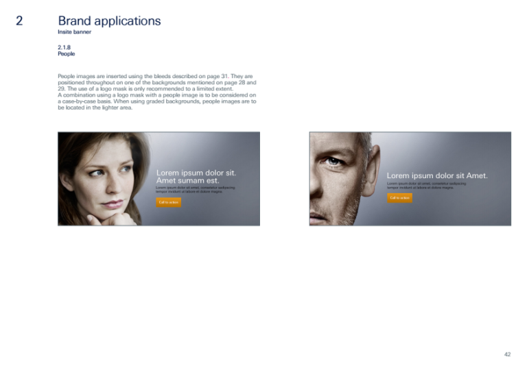
• The "Platinum" Palette: We established a strict logic where backgrounds are desaturated and high-contrast, while color accents (Amber, Bright-Blue, Green, Purple) are used sparingly—never exceeding 40% of the image content.
• Typography: A dual-font system was codified: Arial for system text to ensure universal rendering, and Univers Deutsche Bank for graphical text/key visuals to maintain corporate identity
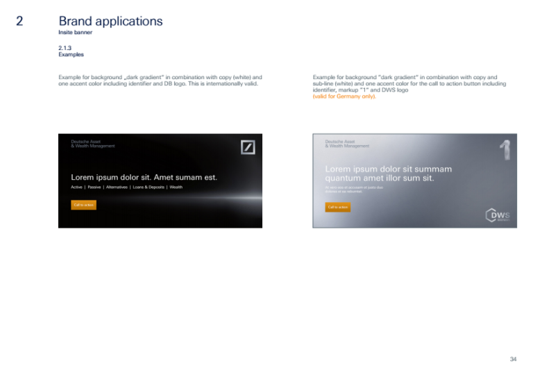
• Logo Integrity: I defined three distinct "Exclusion Zones" (Full, Half, Quarter) to protect the logo from visual interference, ensuring the brand identifier remains distinct regardless of the viewport size.
03. Imagery & "Real" Authenticity
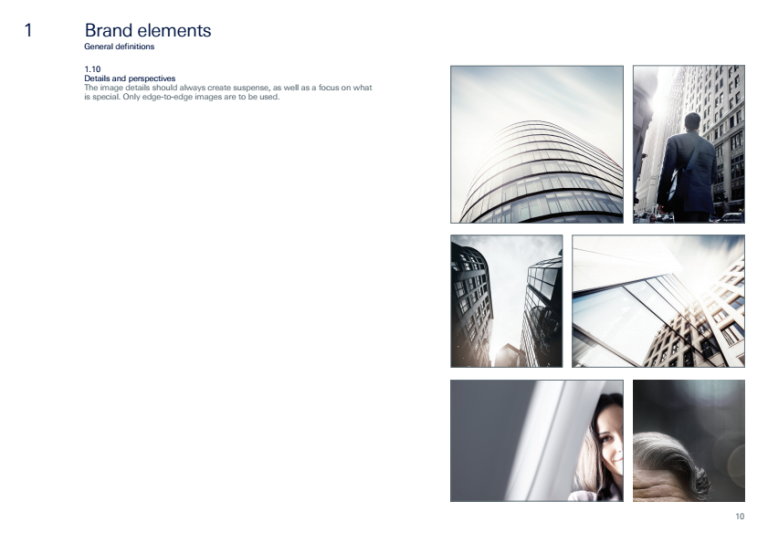
To separate the brand from generic stock photography, I authored strict photographic guidelines.
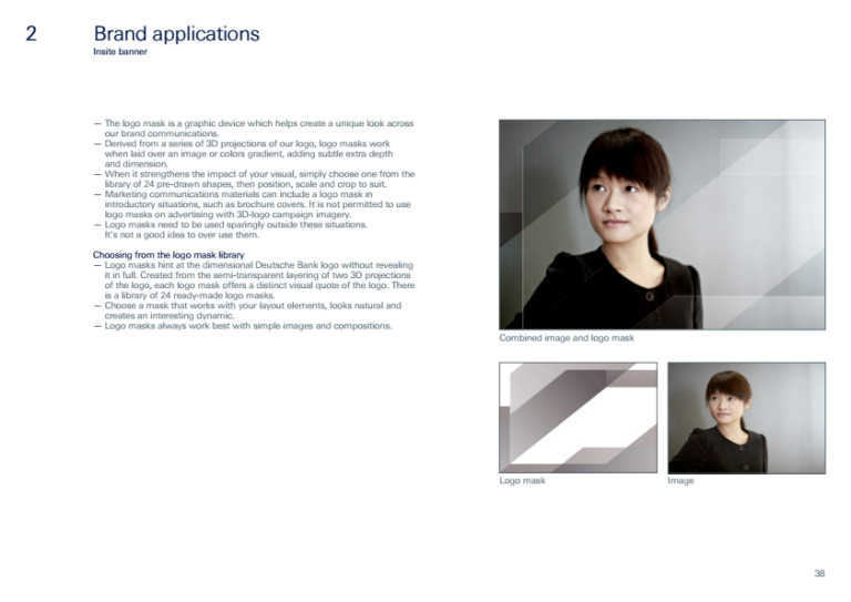
• Authenticity: We banned studio shots. All imagery must depict "real scenes in real surroundings" where the camera functions solely as an observer
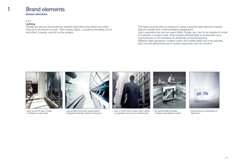
• Lighting Logic: Visuals are dominated by specific natural light sources to create depth and a "positive prevailing mood" without appearing staged. We strictly prohibited "twilight moods" or artificial colored lighting
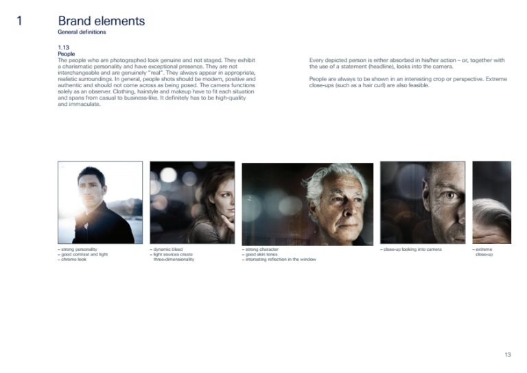
• People: Subjects must look genuine, not posed. We focused on "healthy skin tones" and "charismatic personality" rather than standard corporate models
04. UI & Interaction Patterns
I translated the print brand into a responsive UI kit that prioritized clarity and flatness.
• Iconography: Designed a library of flat-look icons with sharp edges (90° corners) to match the Deutsche Bank square logo. We removed gloss and shine from system icons to maintain a clean, modern aesthetic.
• Interaction States: Defined specific behaviors for mouse-over effects on both light and dark backgrounds, ensuring accessibility and clear feedback loops for the user
• Animation Physics: To maintain a "business-like" appearance, I banned turbulent motion (flipping/dicing). We standardised soft techniques like dissolves and fading, ensuring menus and accordions slide smoothly without distracting "bounce" effects
05. Advertising & Layout Governance
To control the brand across third-party publishers, I created a rigorous grid system for advertising media.
• Safe Zones: Defined mandatory pixel-perfect margins (e.g., 0.25x spacing) for the Identifier and DB Square across all formats, from Super Banners (728x90) to Wallpapers.
• Format Restrictions: We explicitly forbade the use of 120x600 skyscrapers to preserve the aspect ratio and dignity of the creative work
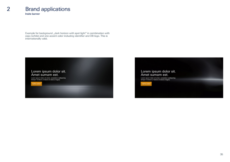
• The Grid: I engineered layout rules that forced copy and logos into specific quadrants, ensuring that "edge-to-edge" imagery never compromised the legibility of legal text or calls to action
Senior Reflection
This project was an exercise in precision governance. By defining not just what the design is, but how it behaves (e.g., prohibiting "flashy" animation and enforcing "calm zones" for copy), I created a scalable framework that allowed global marketing teams to produce thousands of assets that looked like they came from a single hand.
