Enterprise Analytics & Dashboard Framework
Role:
Platform
Deliverables:
UX Lead / System Architect
Tableau & Internal Intranet
Atomic Data Design System, Accessibility Standards, RAG Logic
01. The Objective: Standardising the Signal
In a data-rich environment, "visual noise" creates risk. The existing ecosystem suffered from clashing colours, poor contrast, and inconsistent layouts. My objective was to move the organisation from subjective design choices to a "Common, Repeatable, and Objective" design language
02. Methodology: Atomic Data Design
I applied an Atomic Design methodology to the analytics suite, breaking the interface down into its smallest parts to ensure consistency.
• Elements: Defined the core DNA—Fonts, Spacing, and specific RGB/Hex values for data visualisation
• Components: Combined these elements into functional widgets (e.g., Filter Bars, KPI Cards) that could be reused across different business unit
• Cognitive Load: applied the V.I.M.M. model (Visual, Intellectual, Memory, Motor Load) to minimise the cognitive effort required for traders and analysts to interpret complex datasets
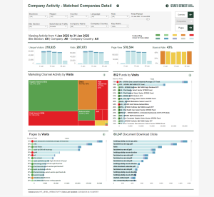
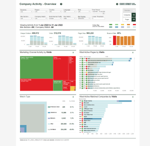
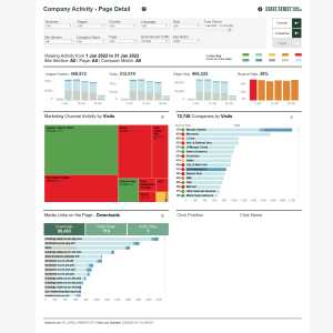
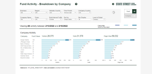
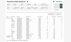
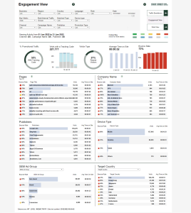
03. The Anatomy of a Dashboard
To reduce the learning curve for users switching between reports, I enforced a rigid "Anatomy" for all production dashboards.
1. Masthead: Standardised branding and title placement to provide immediate context.
2. Filter Logic: A prescribed hierarchy for data selection: Business > Region > Country > Role > Date
3. The Central Frame: A flexible container for specific widgets, ensuring that while data changes, the layout grid remains familiar.
4. Footer: Mandatory inclusion of "Data Sources" and "Last Updated" timestamps to ensure data integrity and trust.
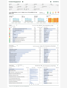
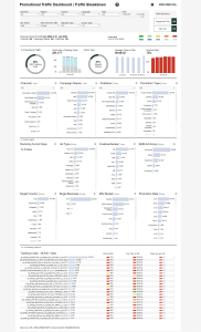
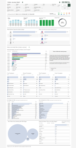
04. The Logic of Colour (RAG & Accessibility)
Colour in finance is functional, not decorative. I engineered a precise RAG (Red, Amber, Green) system to standardise status reporting.
• Threshold Definitions: We moved beyond vague definitions. "Amber" was strictly defined (e.g., a 5% to 15% variance), while "Dark Red" indicated critical failure (e.g., >15% decrease)
• Accessibility First: All colour palettes were tested against accessibility standards to ensure enough contrast for colour-blind users. We eliminated low-contrast pairings (like yellow lines on white backgrounds) that were previously common
• Segmentation: Developed distinct palettes for "Known" vs. "Unknown" entities to allow users to scan client lists and instantly identify relationship status.
05. Design Principles
I established the C.R.A.P. Principles (Contrast, Repetition, Alignment, Proximity) as the baseline for all QA reviews.
• Alignment: Corrected legacy issues where text was inconsistently aligned (left vs. right), which disrupted the reading flow of data tables.
• Contrast: Enforced the use of dark text on light bars (and vice versa) to ensure legibility was never compromised by the data visualisation itself.
Senior Reflection
By creating these guidelines, I shifted the focus from "making charts look pretty" to "making data accessible." This framework allowed the engineering teams to build Tableau dashboards that were not only visually consistent but also compliant with global accessibility standards and aligned with the mental models of our users.