Evolving the Brand – BlackRock Aladdin Platform Redesign
Role:
Strategic Objective:
The Vision:
User Experience and Design Lead
Move from siloed application development to a unified global standard that is "recognisable from across the trading floor"
Creating a "single, definitive source of truth"
01. The Strategic Challenge
Modernising the "Central Nervous System"
Aladdin is BlackRock’s core investment platform, uniting the information, people, and technology needed to manage money in real time. However, by 2013, the platform had not kept pace with the evolution of digital interfaces (benchmarked against 1996–2012 standards).
The Problem:
• Siloed Architecture: Applications were built as independent units rather than to a unified standard.
• Brand Fragmentation: The BlackRock brand was not at the core of the user experience.
• Function Over Form: The prevailing mindset was that “function is the only consideration,” leading to poor readability and high cognitive load
02. Research & User Segmentation
Addressing Diverse Operational Needs
I identified that “different users have different needs,” categorising the global user base to ensure the redesign served varying levels of intensity:
• Power Users: Require high-density data for extended daily sessions.
• Medium Users: Use Aladdin alongside other financial tools.
• Light Users: Access the platform for specific, ad-hoc tasks.
Primary UX Considerations:
1. Readability: Optimising colour contrast, font size, and data scannability.
2. Aesthetics: Creating visual appeal and differentiation from competitors.
3. Ease of Use: Reimagining toolbars and iconography for modern interaction
03. Strategic Orchestration
Moving from “Re-skinning” to Brand Evolution
As the UX Lead, my strategy was not merely to update the interface but to evolve the brand. I championed the philosophy that “Form and function go hand in hand”.
The Path Forward:
• Unified Standards: Mandated that all applications be built to a single, brand-aligned standard.
• Core Values: The new design language was engineered to embody Consistency, Control, and Confidence
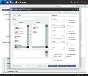
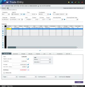
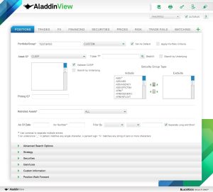
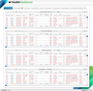
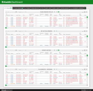
04. Design & Execution
The “Revised Clean Read” Concept
I led the development of several concepts—Vivid, Evocative, and Modular—eventually focusing on the “Revised Clean Read” as the primary solution.
Key Design Elements:
• Integrated Branding: BlackRock brand elements were integrated into a dark, professional header.
• Typography: Selected a print variation of Helvetica for the header to improve legibility.
• Visual Hierarchy: Used a grey/green palette for page elements to reduce eye strain, with vibrant colour used in small doses for emphasis.
• Tactile Interaction: Developed large, tactile interaction elements and “glowing” icons to guide user focus
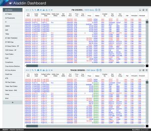
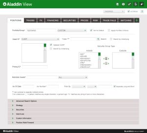
05. The Impact
Achieving the “Single Source of Truth”
The redesign transformed Aladdin from a functional utility into a strategic asset.
• Multi-Monitor Optimisation: Reconfigured the interface to support multiple monitor views, essential for modern trading environments.
• Information Scannability: Intuitively grouped information and modular tactile buttons improved the speed of data processing for power users.
• Brand Recognition: The integration of BlackRock brand elements ensured the platform was instantly identifiable as a premium BlackRock product.
06. Senior Reflections
Form as a Function of Confidence
In a high-stakes financial environment, the “Aesthetics” of a platform are not superficial; they are a function of user confidence. By moving away from siloed development and placing the BlackRock brand at the core, we provided users with a sense of control and stability that legacy systems lacked. The “Modular” approach ensured that this new visual language could scale across the entire Aladdin suite without losing its identity.